
Making space for brands to pop up.
PopShop set out to reimagine retail by turning vacant spaces into vibrant mini marketplaces. They invested in physical spaces and made them available to small vendors as pop-up shops, giving startups and independents a chance to bring their products to life without the heavy cost of permanent retail. With multiple vendors under one roof, each PopShop location became a lively destination for discovery, variety, and community. As part of the branding project, we also explored the website experience, designing a platform that worked for both sides of the market: customers could browse upcoming pop-ups around the city, while vendors could sign up, manage listings, and book their space with ease. PopShop 's ask was to craft a brand identity that could express energy and adaptability, while keeping the idea of “space” at its heart.


Every concept comes from somewhere. After research, stakeholder interviews, competitor as well as competitive research, we dive in to brainstorm. After exploration, great ideas move forward, this stage of a project is so exciting and rewarding.
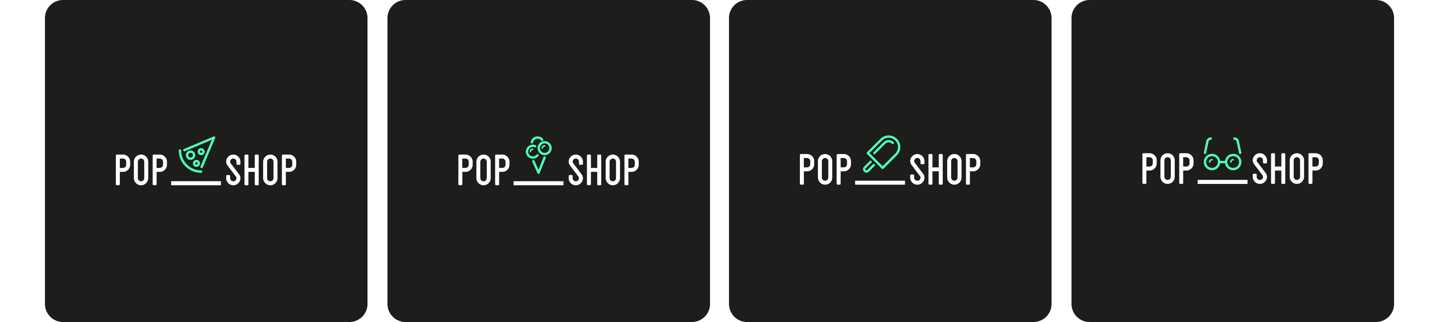
Take a look at some of the other concepts created.
“They delivered a product that we’re very proud of and we’re looking forward to growing.”


